Sterna Environmental Brand Guidelines
The Sterna Environmental brand has been developed to communicate professionalism, trust and expertise while reflecting the organisation's commitment to protecting and enhancing the natural environment.
These guidelines provide a framework for using the brand consistently across digital and printed materials, ensuring every touchpoint delivers a cohesive and recognisable experience.
“I want to be Northern Ireland's most trusted ecological consultancy by providing expert environmental advice that is accessible, reliable and supports sustainable development.”
Brand Values
Combining specialist ecological knowledge with practical industry experience to deliver reliable, evidence-based advice
Expertise
Every recommendation is honest, transparent and grounded in scientific evidence, ensuring decisions are made with the best interests of both clients and the environment.
Integrity
Working closely with developers, planners, businesses and homeowners, Sterna Environmental develops practical, effective solutions for each project's unique challenges.
Collaboration
Sterna Environmental is committed to protecting biodiversity and promoting responsible development that balances environmental conservation with practical project needs.
Sustainability
Ecology can often be complex so information needs communicated clearly and simply. Making technical guidance accessible helps clients make informed decisions with confidence, regardless of their level of environmental knowledge.
Accessibility
Logomark
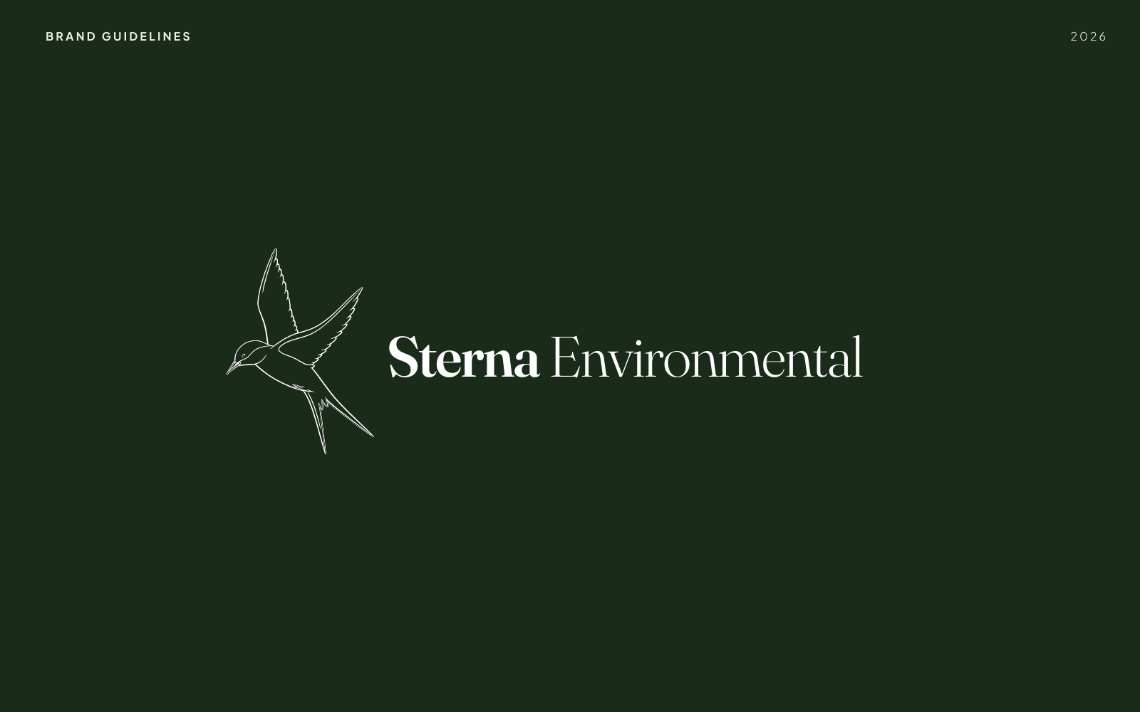
Inspired by the Arctic tern (Sterna paradisaea), the symbol reflects qualities of resilience, precision and adaptability. These are values that align closely with the consultancy's approach to protecting and enhancing the natural environment.
The logo combines a clean, minimalist line illustration of the tern with a refined serif wordmark, creating a balance between professionalism and approachability. The organic curves of the bird convey movement and nature, while the typography reinforces credibility, trust and scientific expertise. Together, these elements create a timeless identity that is distinctive, memorable and suitable across both digital and print applications.
Typography
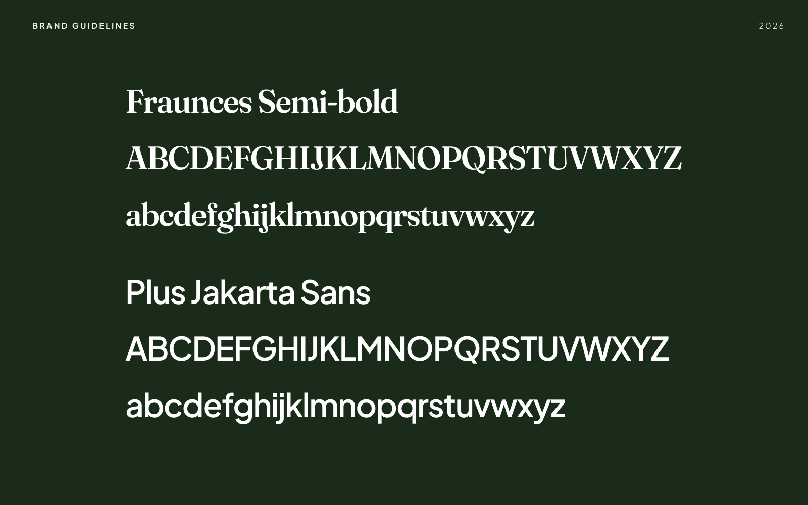
The typography has been carefully selected to reflect Sterna Environmental's expertise while maintaining a professional, approachable and contemporary identity.
Fraunces is used for headings and subheadings, bringing a sense of credibility, confidence and heritage through its elegant serif style. Complementing this, Plus Jakarta Sans is used for body copy and supporting text, offering exceptional readability across both digital and print applications.
Together these typefaces create a clear visual hierarchy that enhances readability, supports accessibility and ensures a cohesive brand experience across all touchpoints.
Brand Colours
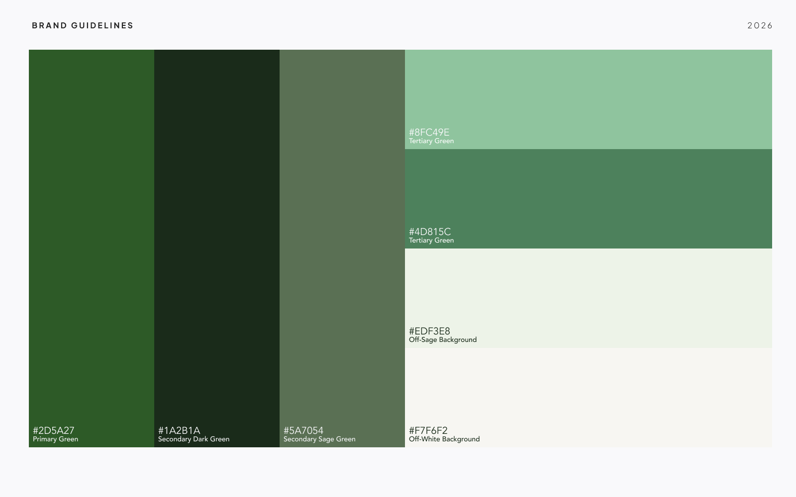
The Sterna Environmental colour palette has been inspired by the natural landscapes of Northern Ireland, drawing on the rich greens of native woodlands, coastal vegetation and open countryside.
The primary green forms the foundation of the visual identity, symbolising nature and sustainability. It is used across key brand elements such as buttons, headings, navigation and calls to action and helps to create a strong and recognisable presence throughout the website.
Alongside this I chose two secondary greens, a deep forest green that adds depth and contrast to sections such as feature panels and the footer and a softer sage green which provides warmth and acts as a subtle emphasis for icons and supporting interface elements.
Together, these colours create a cohesive visual hierarchy that reflects the brand's connection to the natural environment while maintaining a clean, professional look. The palette is balanced with warm off-white and soft sage-tinted backgrounds, providing generous white space that enhances readability and allows imagery to take centre stage.
Imagery
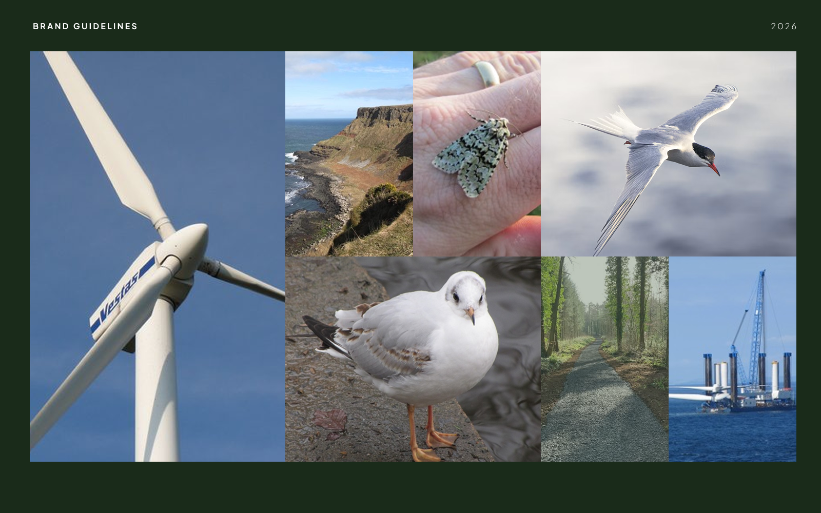
The imagery used throughout the website has been selected to reflect the consultancy's connection to the natural environment and reinforce its expertise in ecological surveying. Featuring landscapes, native wildlife and natural habitats, the imagery provides an authentic representation of the environments in which the company operates while showcasing the importance of biodiversity and conservation.
These images are used to create visual impact, break up content and add depth to the overall user experience. The imagery works alongside the muted colour palette and clean typography to create a calm, welcoming aesthetic that reflects the brand's values of sustainability, integrity and expertise. Together, these visual elements establish a consistent and engaging identity that strengthens the brand while allowing the content to remain the primary focus.
Brand Application

Want To See More?
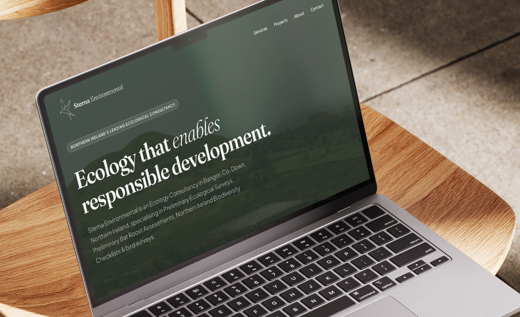
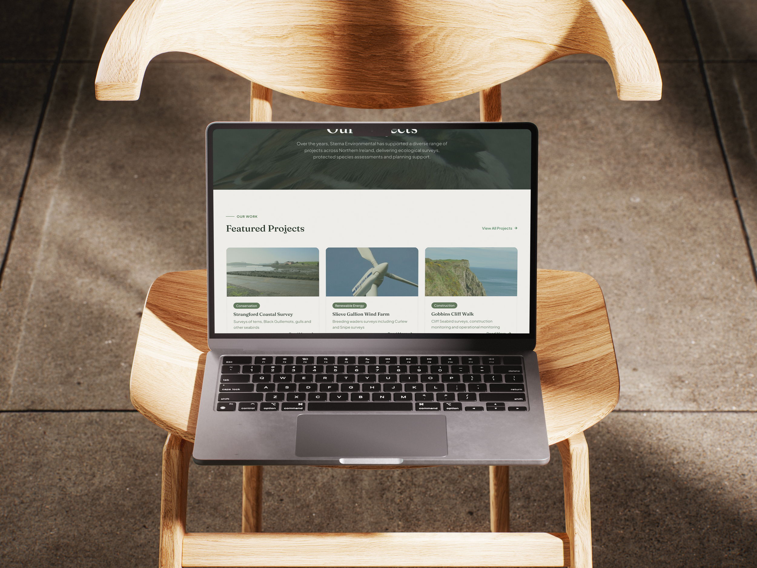
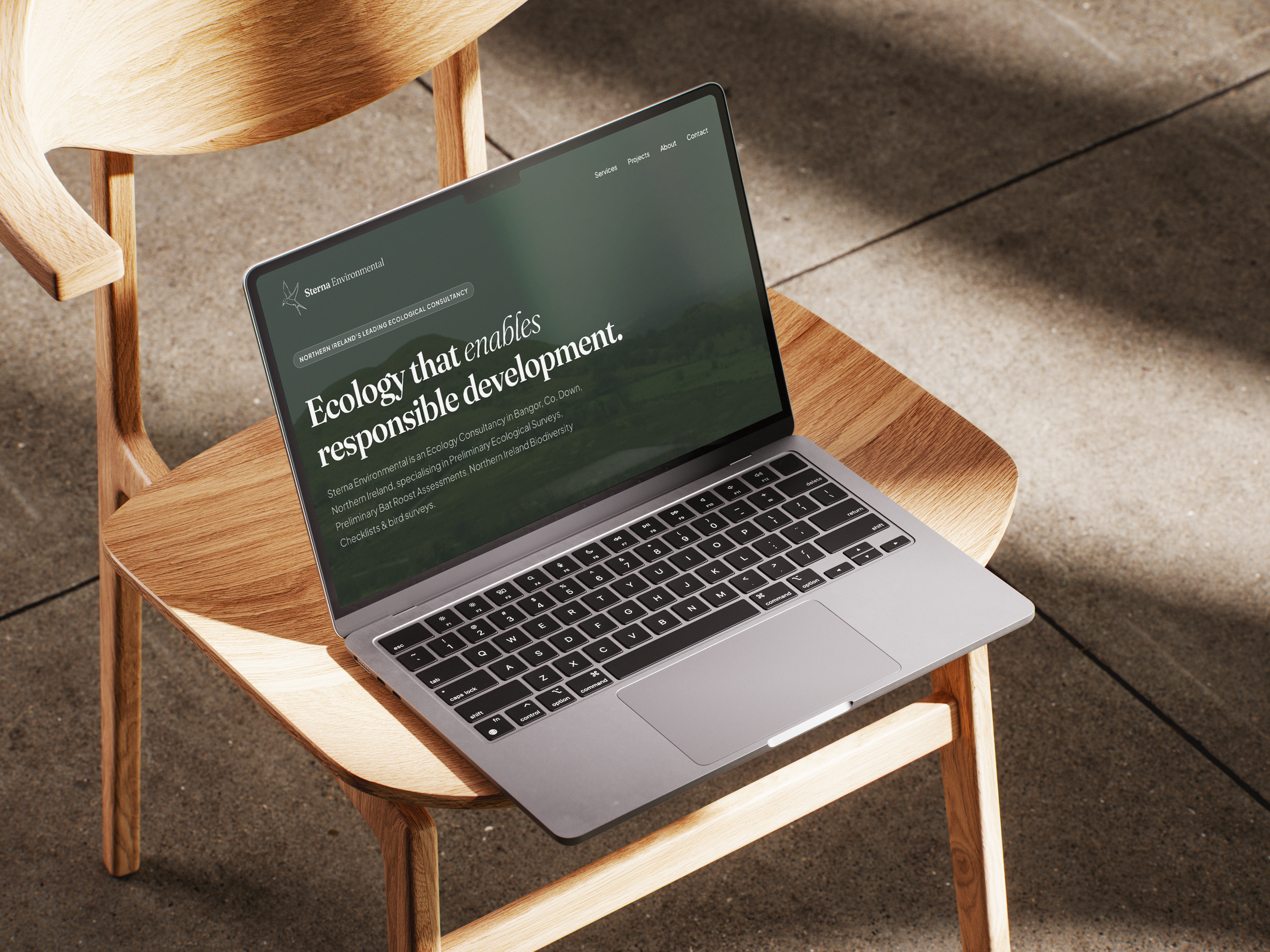
See how these brand guidelines have been applied throughout the Sterna Environmental website below: