Ecology Website Redesign
I was approached to redesign an ecological consultants website which no longer reflected the quality of their services or the needs of their growing client base. Serving developers, planning consultants, and members of the public, the business required a modern, user-centred website that clearly communicated its expertise, improved navigation and created a more engaging and professional online experience.
The project involved research, persona development, competitor analysis, information architecture, wireframing, visual identity design, high-fidelity prototyping and responsive interface design.
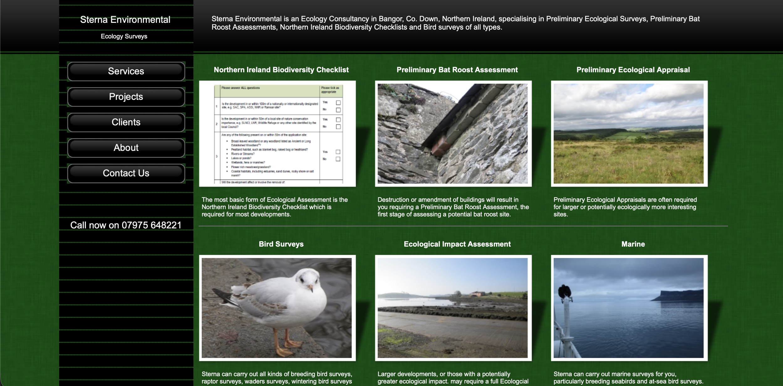
Understanding the Business
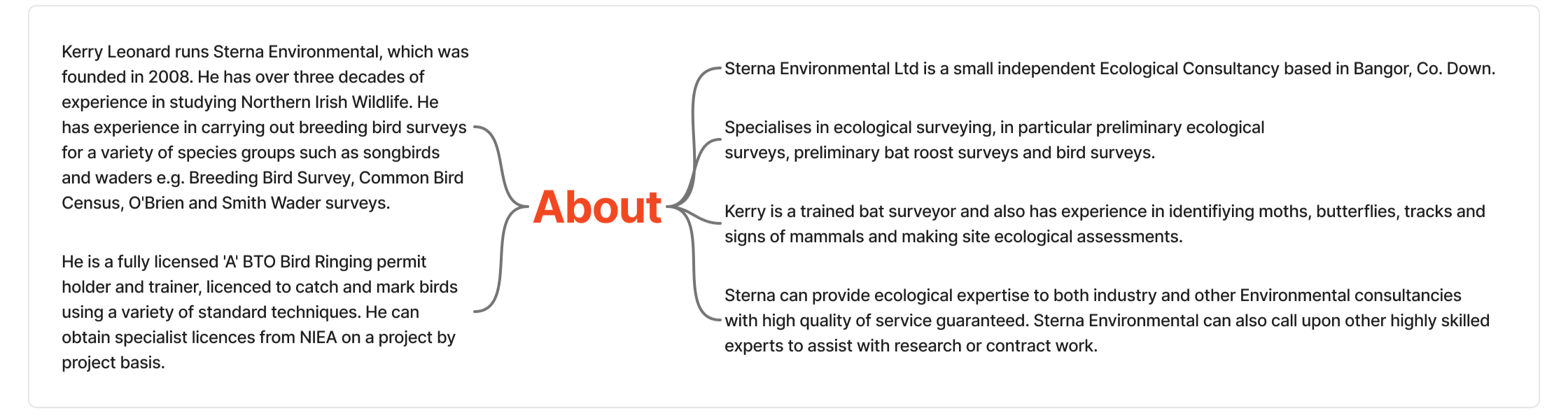
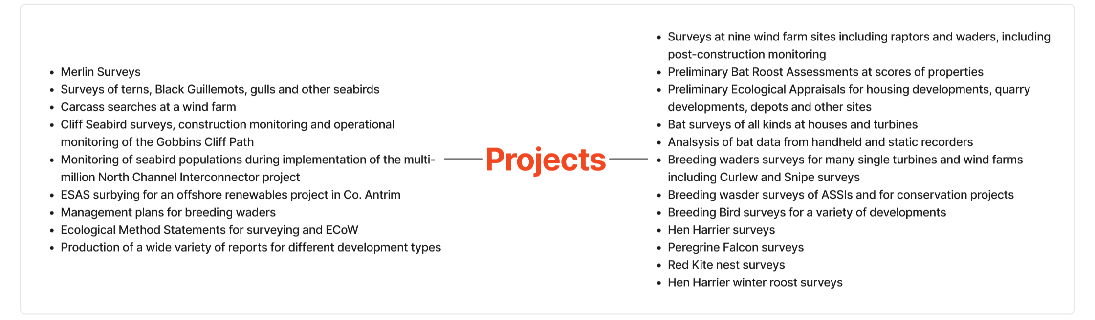
Before exploring design solutions, I first focused on understanding the business. Through discussions with the client, I gained insight into the services, target markets and long-term objectives, establishing a clear understanding of what the new website needed to achieve beyond simply presenting information.
I mapped out the company's core services including ecological surveys, protected species surveys, environmental impact assessments, biodiversity assessments and planning support while also identifying the key business goals for the redesign.
These included modernising their online presence, showcasing their expertise and specialist services and strengthening trust through case studies, project examples and professional credentials. These insights formed the foundation of the project, ensuring every design decision aligned with both user needs and business objectives.
Understanding the Users
Once I understood the business goals, I started to think about the people who use the website. As the environmental company serves a diverse range of clients, from contractors to members of the public, it was important to understand their different motivations, goals and expectations before considering the website's visual design.
I developed three key personas representing their primary audiences: a member of the public, a renewable energy development manager and a senior planning consultant.
Each persona highlighted distinct goals, challenges and information needs. For example, a members of the public often requiring simple, jargon-free explanations of ecological surveys and reassurance throughout the planning process, while planning consultants or renewable energy developers prioritise technical expertise, detailed service information and confidence that ecological work can be delivered within strict planning deadlines.
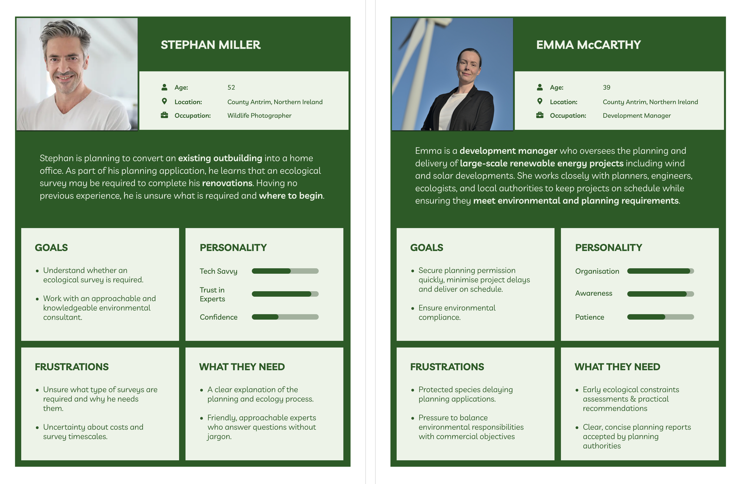
These insights will directly informed the website's information architecture, navigation, content strategy and call-to-action and ensure the final design effectively balanced the needs of both commercial clients and the public.
Competitor Analysis
I then explored the wider market to understand how environmental consultancies and other professional service firms communicate their expertise online. Rather than replicating existing solutions, my aim was to identify common UX patterns, understand industry best practices and uncover opportunities for the redesign to be different.
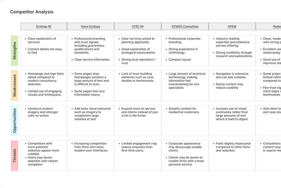
I analysed sixteen competitor websites, evaluating aspects such as navigation, content structure, visual design, branding, calls-to-action, trust signals, photography, mobile experience and accessibility.
While many competitors demonstrated strong technical expertise through professional branding and clear service information, several recurring usability issues emerged. These issues included the over reliance on dense blocks of text and limited visual hierarchy, making content difficult to scan. As well as that calls-to-action and interactive content was minimal and valuable trust signals such as case studies, testimonials and client success stories were either difficult to find or missing altogether.
The research also highlighted several consistent strengths across the industry such as straightforward navigation, nature inspired colour palettes, professional imagery and easily accessible contact information, reinforcing the importance of clarity and credibility within the environmental consultancy sector. These findings provided a strong evidence base for the redesign, helping ensure design decisions were informed by observed usability patterns rather than personal preference.
Information Architecture & Flow
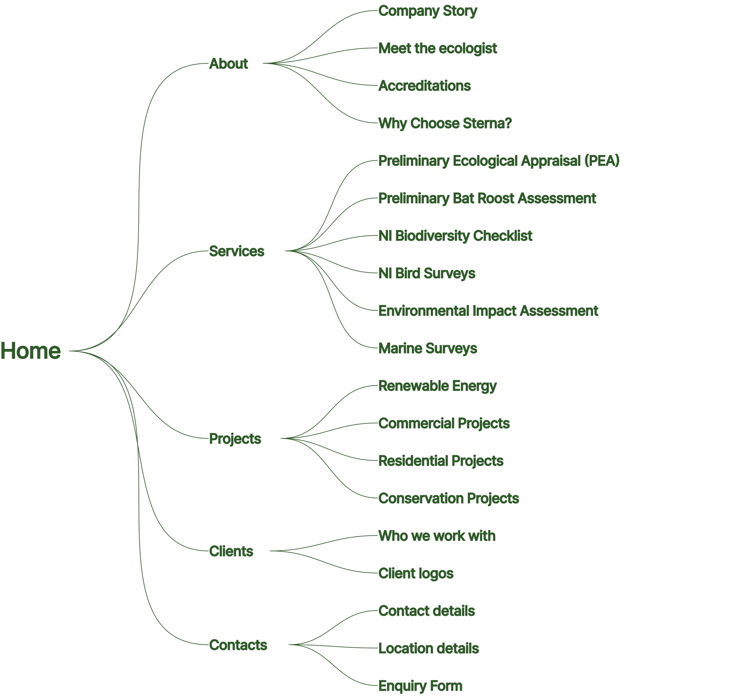
Using insights from my research, I developed a clear information architecture that organised the website into intuitive sections based on users' primary goals. The navigation was structured around five key areas About, Services, Projects, Clients and Contact. I structured it like this to ensure it is easy for users to find the information they need.
To support this, I mapped out detailed user flows for each page, defining the content hierarchy and sequence of content from the hero banner through to the call-to-action. This ensured every page had a clear purpose, guided users through relevant information and supported key journeys such as exploring services, viewing past projects and submitting an enquiry.
By establishing the information architecture earl, it provided me with a scalable framework for the website, informed the wireframing process and ensured content was prioritised effectively.
Design Development
To speed up the initial design phase, using artificial intelligence, I curated a detailed prompt that incorporated the site's structure, content hierarchy and visual direction. I then used AI tool “Figma Make” to generate a baseline design, allowing me to quickly explore the overall layout and page composition.
However, rather than using the AI output as a final solution, I refined every page to better reflect Sterna Environmental's brand and values. I also adjusted the visual hierarchy, spacing, padding and typography to improve responsiveness across different screen sizes and introduced reusable Figma components to ensure consistency and scalability throughout the website.
This iterative process combined the user-centred design principles I had establish with the speed of AI and resulted in a polished interface tailored to both the business and its users.
Final Design
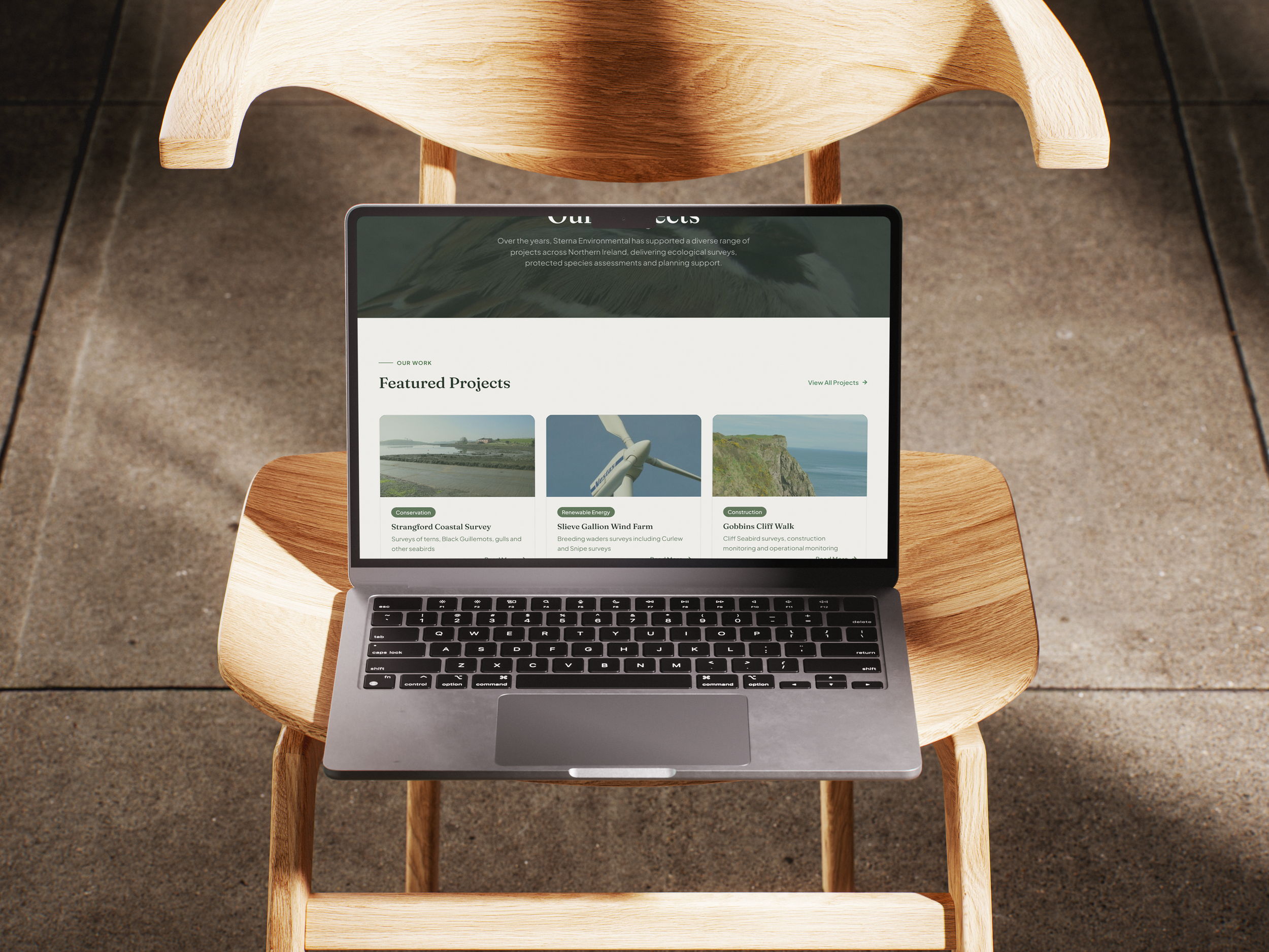
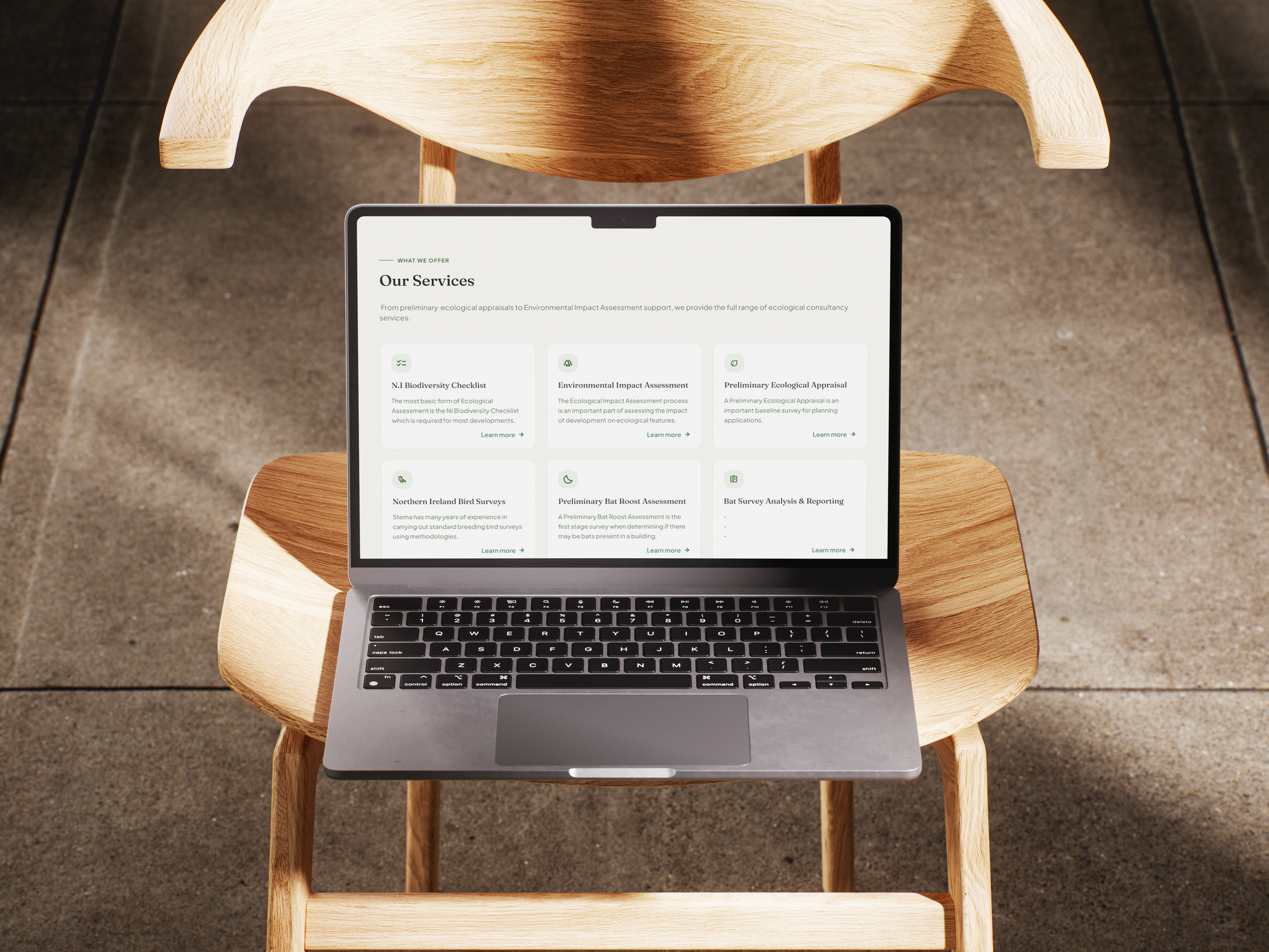
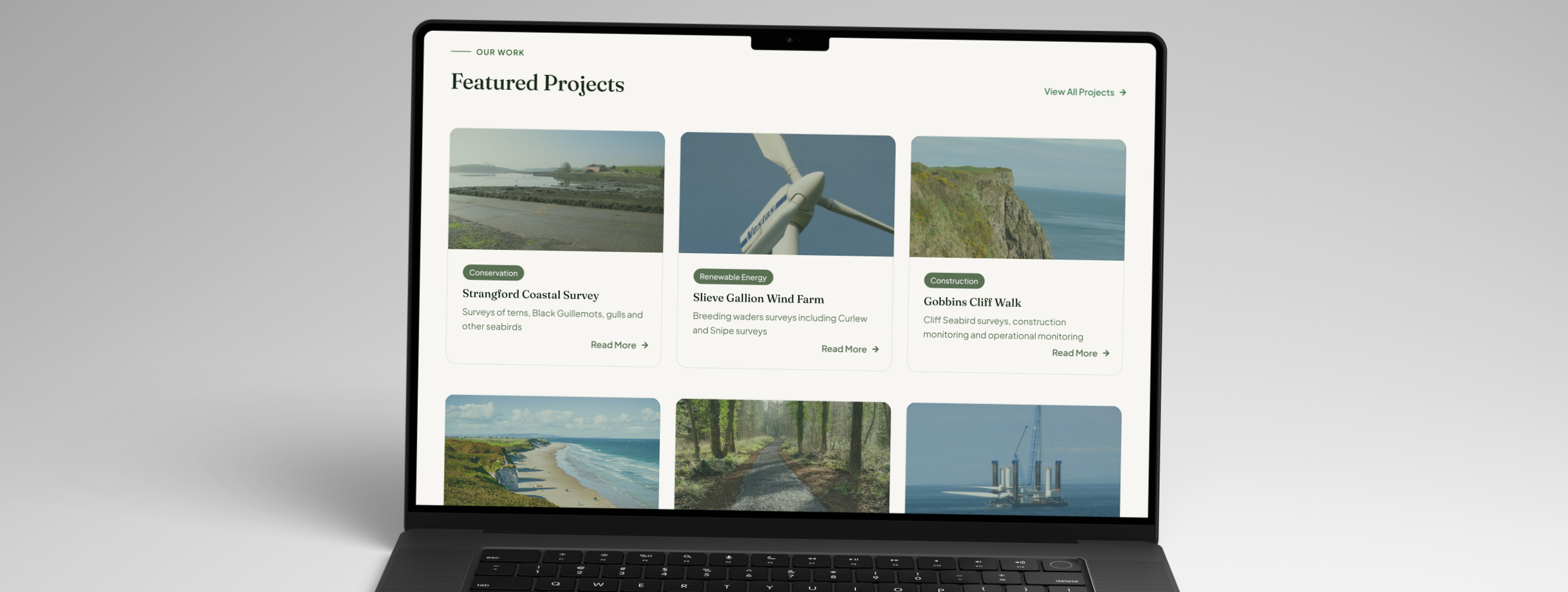
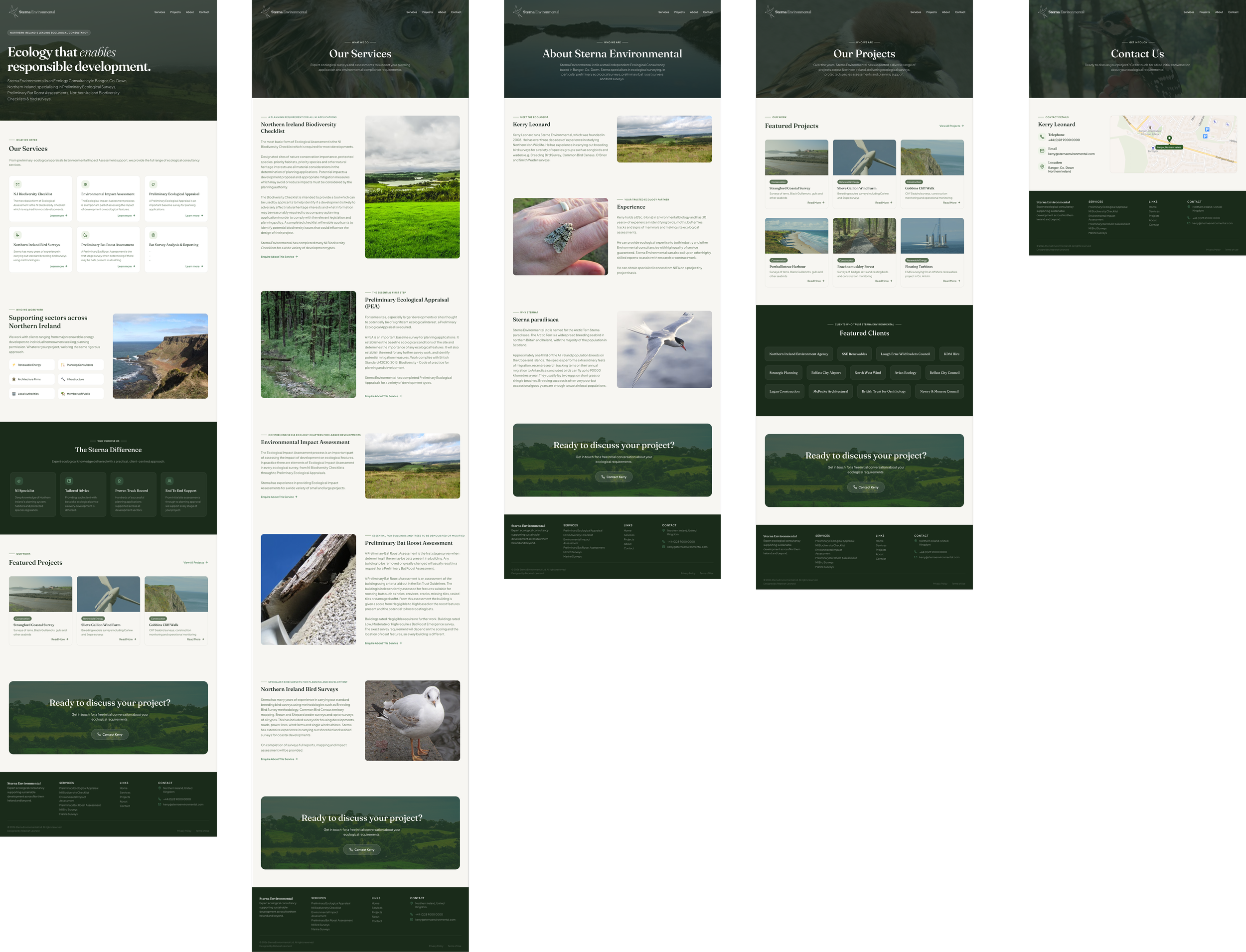
The final website delivers a modern, professional and user-centred experience that reflects Sterna Environmental's expertise while making complex ecological services easy to understand.
Using my research and competitor analysis, I created a clean visual hierarchy, intuitive navigation and clear calls-to-action that guide users from learning about the company to making an enquiry
The design combines natural imagery with a muted green colour palette and refined typography to reinforce the brand's connection to the environment.
Consistent spacing, reusable components and responsive layouts create a cohesive experience across every page, while dedicated sections for services, projects, client sectors and company credentials build trust and showcase Sterna's breadth of experience.