Stepper Redesign
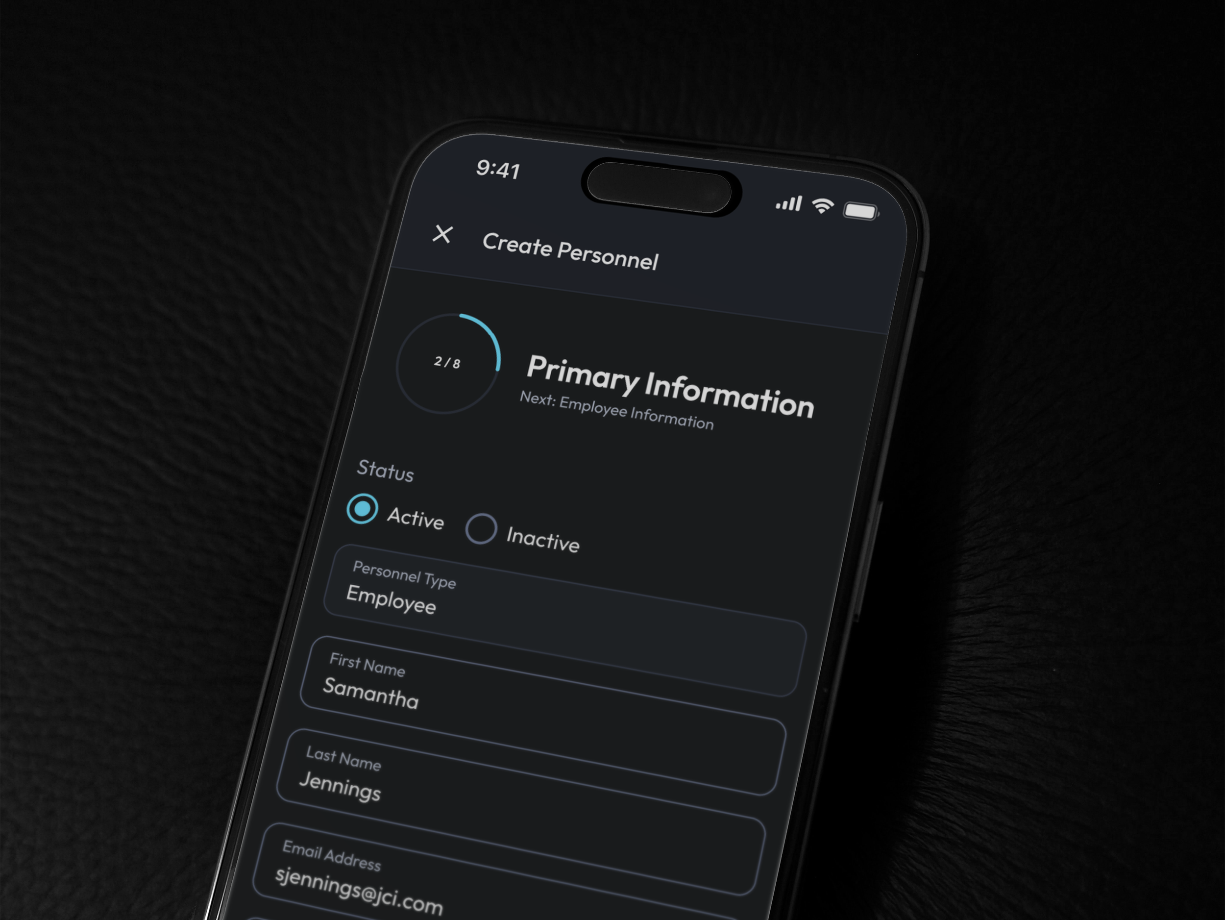
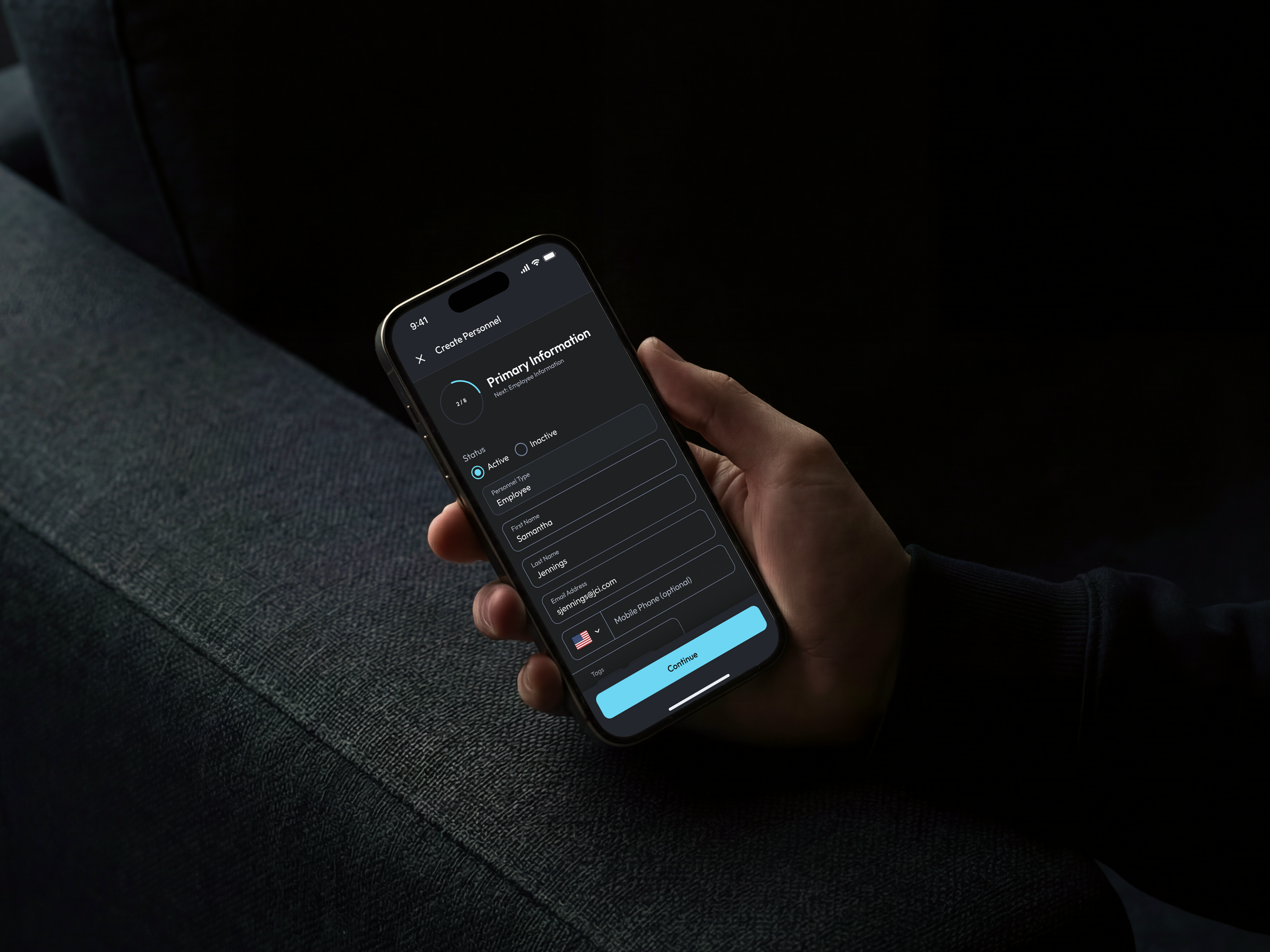
During an internal project at Johnson Controls, I was tasked with redesigning the stepper component used throughout our mobile forms. The existing horizontal stepper consumed valuable screen space while providing little context, making it unsuitable for smaller mobile displays and creating a poor user experience during multi-step workflows.
My objective was to explore alternative stepper patterns that were more scalable, space efficient and better suited to the constraints of mobile devices while maintaining clear visibility of users' progress through multi-step workflows.
The Problem
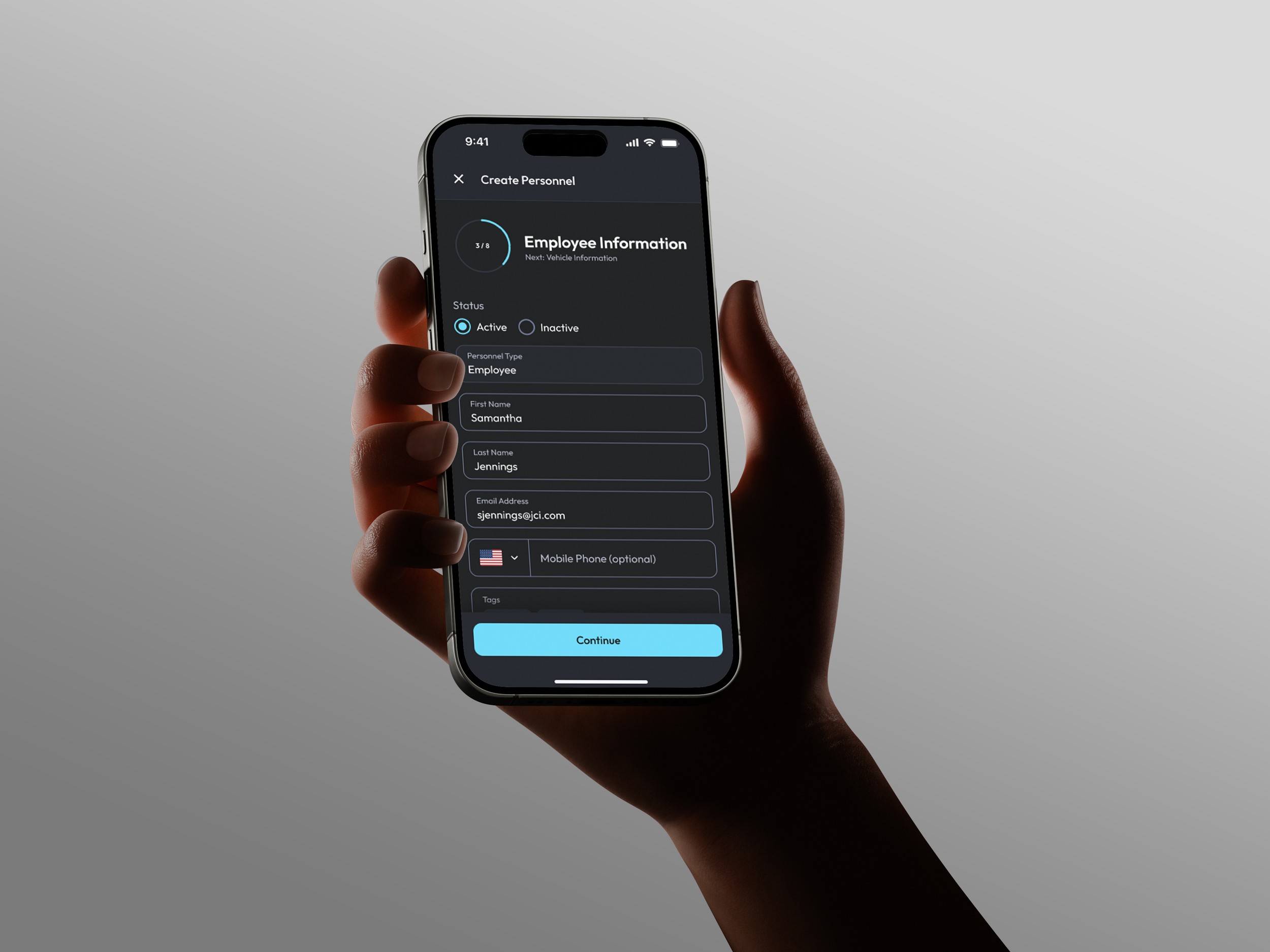
The existing stepper pattern was designed for desktop and is not responsive for mobile devices, meaning mobile workflows are limited to a maximum of 3 steps.
As mobile forms became more complex, the component occupied a lot of screen space, reducing the area available for form content and negatively impacting usability.
Research
To help identify potential solutions, I researched common mobile stepper patterns used across industry leading products, analysing how different applications communicate multi-step workflows and why particular patterns are adopted.
I evaluated each approach against factors such as screen efficiency, progress visibility, scalability, ease of use and their suitability for longer workflows. I focused on the workflow patterns and how effectively they balanced the user needs with the constraints of mobile interfaces rather than how it looks visually or aesthetically on the screen.
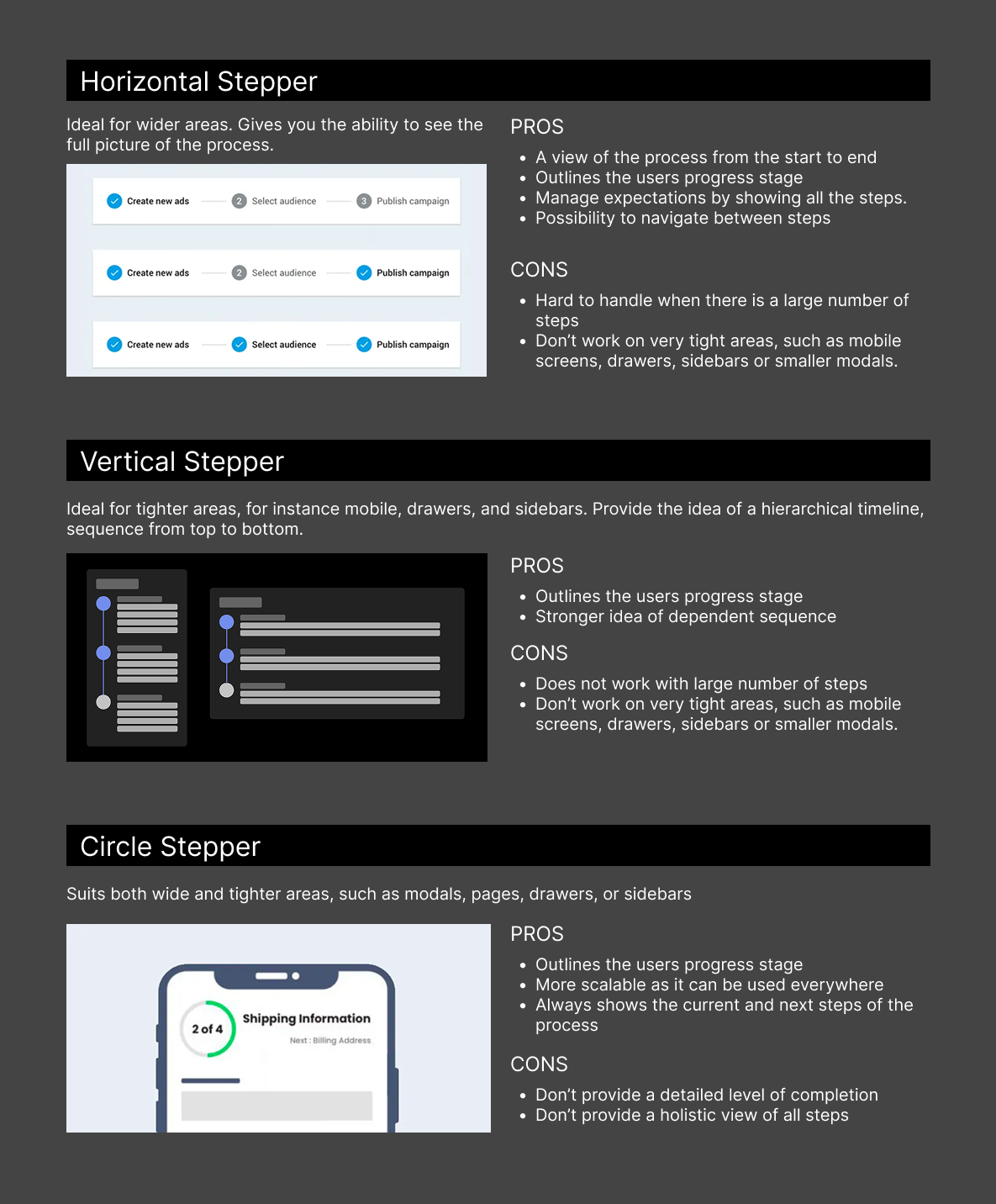
This research revealed to me that the majority of solutions could be categorised into three primary patterns:
Horizontal steppers
Vertical steppers
Circular or progress-based indicators.
I documented the strengths and limitations of each stepper option and compared them against the needs of our product. This allowed me to evaluate which option would be best suited for our product while also efficiently making use of the limited screen space and scaling effectively across workflows with different numbers of steps.
The research also highlighted that many modern mobile applications are moving away from traditional numbered steppers and are more in favour of simpler progress indicators paired with descriptive titles. These patterns provide users with sufficient context while also reducing cognitive load and freeing up valuable screen space for the primary task.
Product Development
These insights gave me confidence that there was an opportunity to improve the existing experience and provided a clear direction for exploration. I used this to develop a range of design concepts that reimagined how progress could be communicated on smaller screens.
My goal was to reduce the amount of space dedicated to the stepper while ensuring users always understood where they were in the workflow and what remained to be completed.
I started by mapping the existing mobile workflow to understand how the stepper is used throughout the users journey. This helped me to identify where the user requires the most context and guidance as well as ensuring that each concept could scale to different workflow lengths without compromising the user experience.
I explored several approaches using different stepper styles and screen layouts in order to find the right balance between visibility, usability and efficient use of screen space.
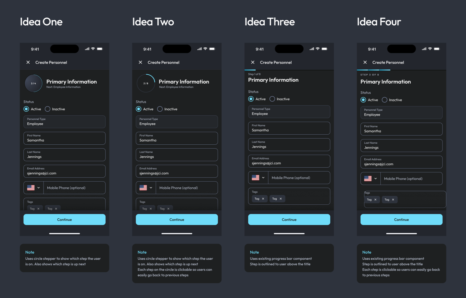
-
My first concept replaced the horizontal stepper with a circular progress indicator that displayed the current step alongside the next stage in the process.
This created a much cleaner interface however the concept lacked a clear way for users to navigate back to previous steps, making it less suitable for longer workflows where users may need to review or edit information.
-
Building on from my first concept, I introduced clickable step indicators around the circular progress component so users could return to their previously completed steps.
This maintained the cleaner and more space efficient design benefits of the circular design while also improving the navigation and making the workflow more flexible.
-
I then moved away from the circular approach and instead reused the existing progress bar component which displayed the current step above the form.
This solution was simple and familiar to users while also reducing the visual clutter on screen. Although it improved scalability, it still didn't provide an intuitive way to revisit previous steps.
-
This progress bar concept used the compact progress bar to maximise screen space while clearly displaying the current step and overall progress. It also gave users the flexibility to navigate backwards and revisit previous steps.
Final Design
Following a team review, Idea two was selected as the final solution as it provided the best balance between usability, scalability and efficient use of screen space.
Compared to the original design, the final concept reduced visual clutter, created more space on screen for the form content and introduced a more modern, scalable approach that was better suited to mobile devices while still maintaining clear progress throughout the process.
I finished the project by turning the new progress stepper solution into a reusable Figma component, using properties and variables to support flexible step counts and different workflow requirements.
This helps ensure the stepper can be used seamlessly across multiple workflows while maintaining consistency in design and behaviour. Integrating it into the Johnson Control design system helps improve scalability, reduces duplication and makes it easier for designers to implement and maintain the component across future experiences.