Iconography Library
A consistent icon system is a fundamental part of an effective design system. It helps users recognise actions and navigation patterns quickly while enabling designers and developers to work from a shared visual language.
At Johnson Controls as their products had evolved, the icon library had grown organically, resulting in inconsistencies that affected both the user experience and the efficiency of the design and development process.
This project focused on standardising the iconography across the product by adopting Google Material Icons as the primary icon set, creating custom icons where required and restructuring the Figma library into a clear maintainable system. The outcome was a single source of truth that improved visual consistency, simplified maintenance and streamlined collaboration between design and development.
The Problem
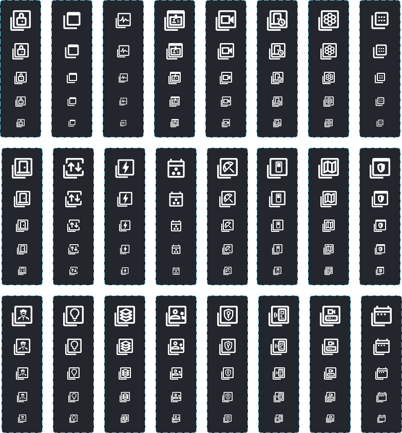
The current icon library lacked consistency as icons had been sourced from multiple libraries and custom assets. This made it difficult to maintain, causing inconsistencies between design and development. Additionally, the iconography library in Figma was disorganised, making it challenging for designers to find, manage and apply icons consistently.
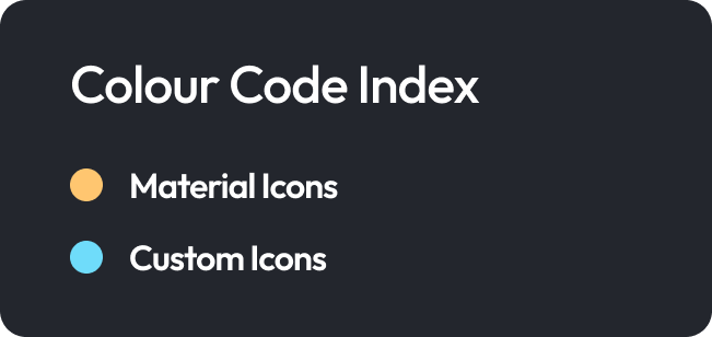
The goal was to create a single, standardised icon library to improve consistency, maintainability and developer efficiency. To achieve this we adopt Google Material Icons as the primary icon set and design custom icons where suitable Material Icons were unavailable, ensuring they aligned seamlessly with the existing visual language. I also aimed to reorganise the Figma iconography library into a clear, intuitive structure, creating a single source of truth that streamlined collaboration between designers and developers.
Audit
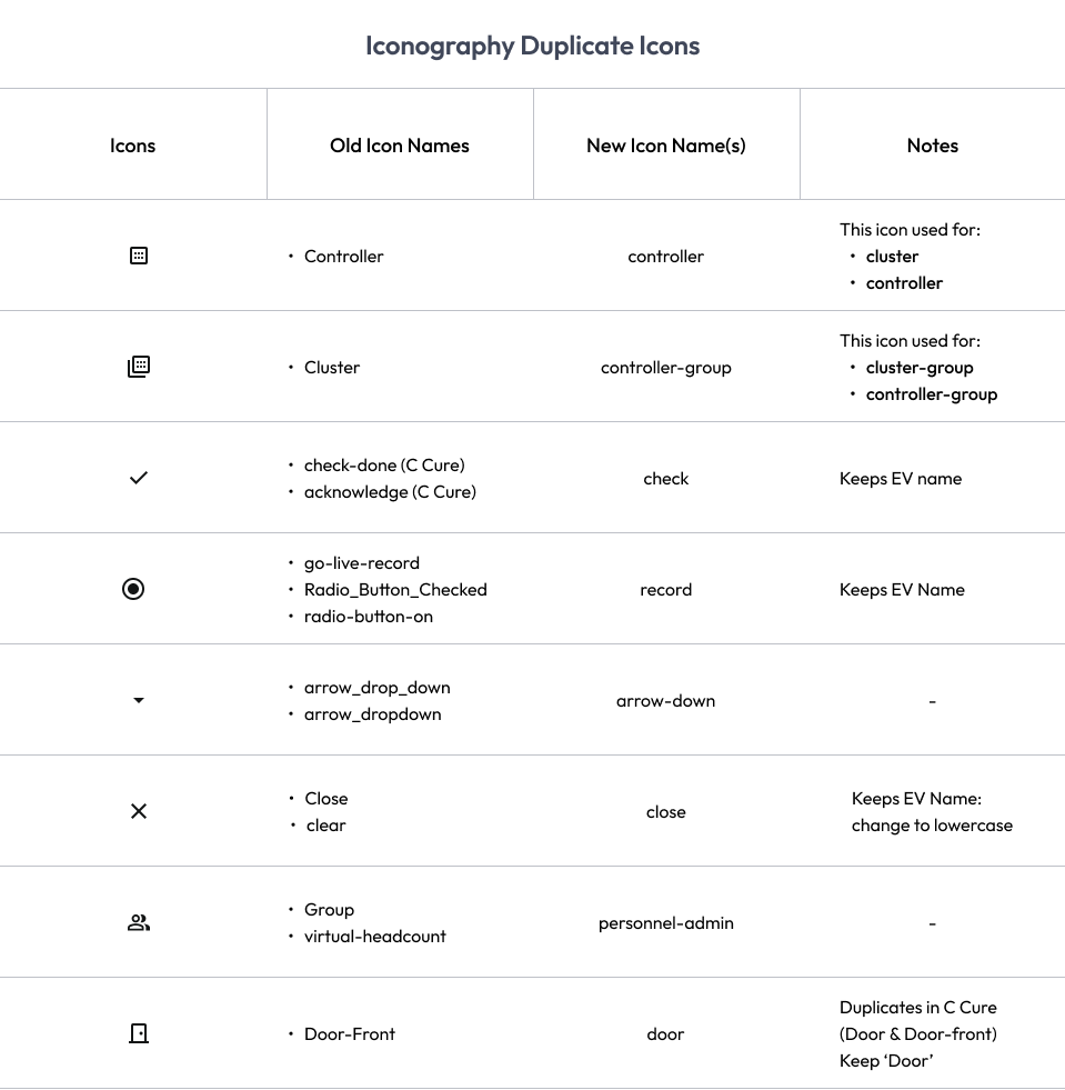
Before making any changes, I carried out a comprehensive audit of the existing icon library to identify the inconsistencies and create a clear migration plan. I documented every icon within a table, comparing the existing library against Google Material Icons and recording the actions required for each asset.
This audit helped me identify several areas where the icons needing improvement and I could group them into their intended changes such as:
Duplicated icons - these were icons which performed the same function but had different names or visual styles.
Naming inconsistencies, such as uppercase to lowercase changes and underscores being replaced with dashes to follow Material Design naming conventions.
Icons requiring replacement with Google Material Icons to align with the new standard.
Legacy or custom icons that required redesign because no suitable Material Icon existed
This audit also provided developers with clear documentation of updated icon names and replacements, making the transition to the new library straightforward and reducing the risk of errors.
Following the audit, I redesigned the structure of the icon library to make it easier for both designers and developers to find and use icons efficiently in their day to day work. The previous library lacked a logical organisation, making it time consuming to locate the correct icon and increasing the likelihood of duplicate or inconsistent usage.
Library Reorganisation
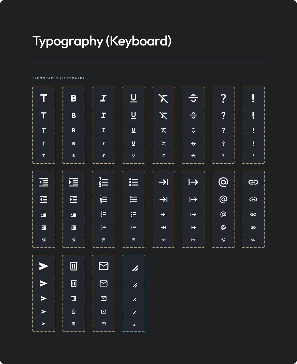
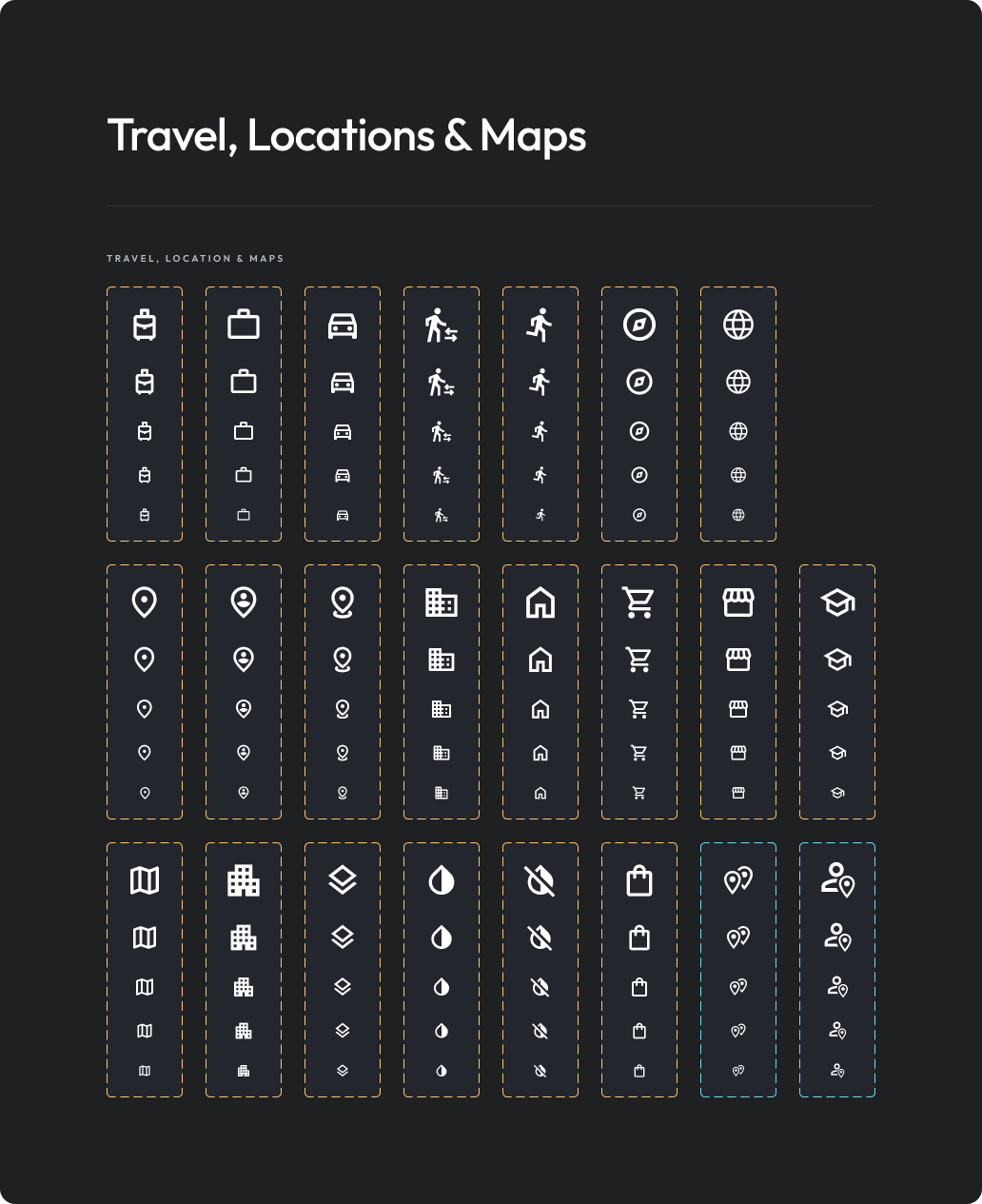
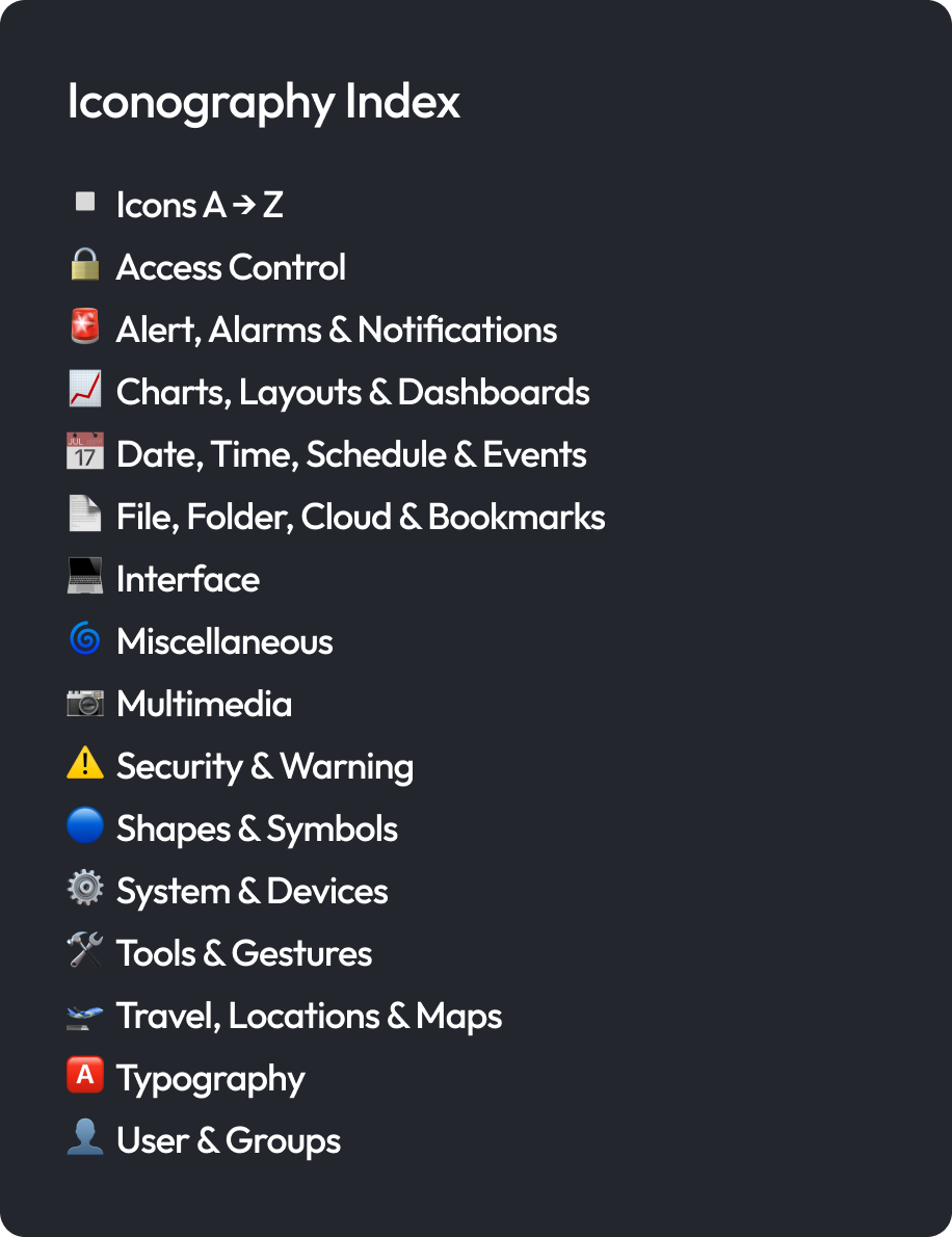
I organised the main iconography library to be alphabetical, enabling users to locate icons quickly by name when they already knew the icon they were looking for. Following feedback from both the design team and developers, I also introduced a secondary method of navigation by categorising icons based on their function.
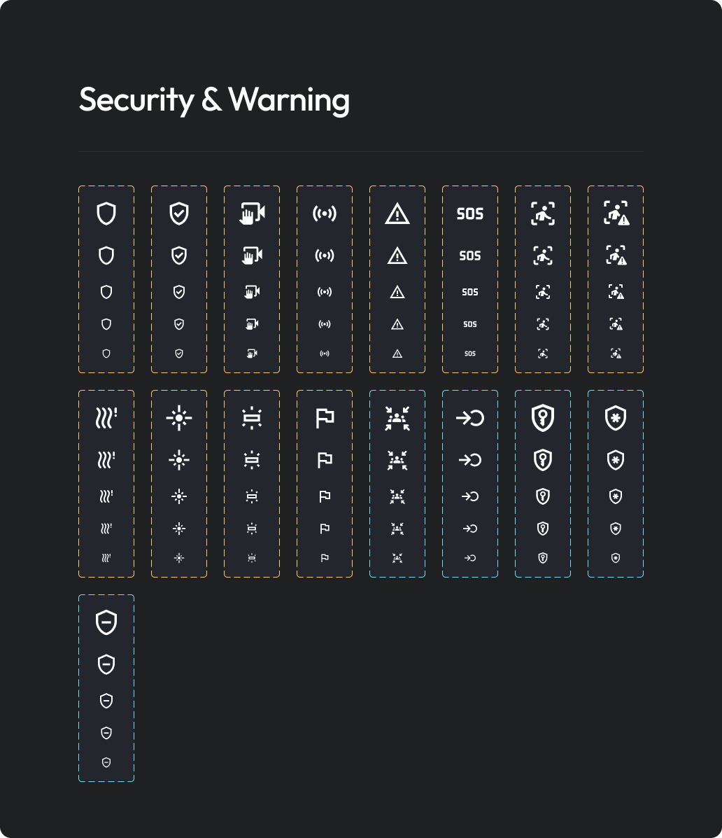
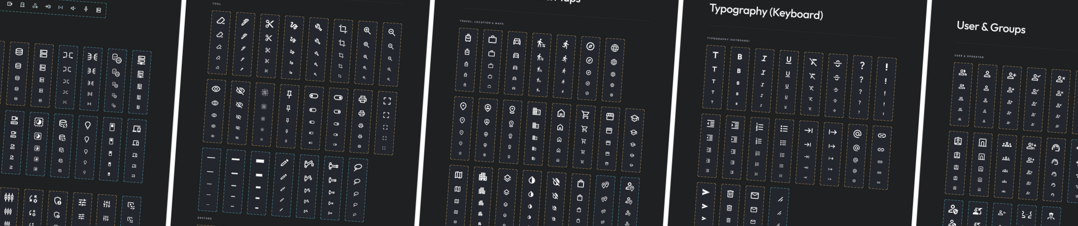
Icons were grouped into intuitive sections such as Access Control, Alerts & Notifications, Charts & Dashboards, Date & Time, Security & Warning and User & Groups enabling the team to quickly navigate to the relevant section rather than searching through a large, unstructured collection.
By providing two intuitive methods of navigating the library - alphabetical browsing for users who knew an icon's name and functional categorisation for those exploring by use case, the library became faster and easier to navigate. This improved discoverability, reduced the time spent searching for assets and created a scalable system that supported the workflows of both designers and developers.
Final Outcome
The result was a fully standardised icon library that provided a single source of truth for both designers and developers. By aligning the library with Google Material Icons, removing duplicate and inconsistent assets and introducing clear naming conventions, the library became significantly easier to maintain and scale as the product evolved.
Overall, this project strengthened the design system by improving consistency across the product, streamlining collaboration between design and developers and creating a more efficient and reliable process for using and maintaining iconography.